When you Begin with Photoshop start with an easy line.
Example 1
What is a Line?
A line is a form with length width, but no boundaries.
What are implied Lines?
Implied Lines are a series of lines or points that are connected automatically every time you see them.
Psychic line is a line made by a mental connection, not an actual line but we feel the line. You can use a psychic line to draw attention to an object without using an actual line
Lost and Found Lines
Photography by Camren Stacy. Day Glow. Austin . 2012
Contour and Gesture Are two types of drawing .
Photography by Camren Stacy. North Carolina. 2011.
What is the difference between contour and Gesture Lines?
Contour Lines: used to find edges. Also to create boundaries around or inside an object .
Gesture Lines: Are quick and rough continuous lines (form of movement)
Chapter 8: Shape
Now make a shape using the tools create a basic shape to show positive & Negative Space.
Example 2
What are Shapes ?
Shape is an area created by enclosed lines or use of color and value to give form .
We use the term figure to describe an object in the foreground, we use ground to describe space between figures.
Figure and Ground = Negative & Positive
Biomorphic Shapes : Biomorphic shapes are shapes inspired by nature.
journal.davidbyrne.com
Shapes take form of naturalism, idealism, and distortion .
Naturalism : capturing the world around us .
Idealism : the world we want it to be.
Distortion : A distorted or unnatural shape.
Non Objects : Non objects are shapes that are unfamiliar to us, not of our world so to say.
Chapter 9 : Pattern and texture
Texture is the surface quality of objects that appeals to the tactile senses.
Pattern is a design we can see on objects in paintings and drawings. A pattern is also made up of lines and curves arranged in fashion; It is constantly nonexistant. A Pattern can also be so consistant as the blind vision with its informity.
Now with Photoshop try to illustrate Pattern and texture.
Example 3
Pattern is a design we can see on objects in paintings and drawings. A pattern is also made up of lines and curves arranged in fashion; It is constantly nonexistant. A Pattern can also be so consistant as the blind vision with its informity.
Texture
Pattern
Camren Stacy Photography. SA. 2012
Visual Textures are images of a object with Texture.
Tactile Texture -is the use of material create a surface that can be felt . This can be used to create a 3 dimensional surface .
Caitlyn Cronins Blog. sept 19, 2010.
Chapter 10 : Illusion of Space
Here im showing illusion of space using a simple positive and negative space picture.
Example 4
How do we explain 3D to 2D shapes:
A 2D shape is a flat object . For Example a square, circle ect.
3D shape is a shape in space. For Example a cube, sphere, ect.


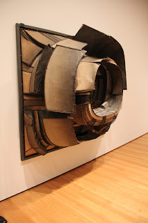
These are Pictures I took when i was at the museum in New York .
It Best describes 2 different perspectives on 1 piece.
Camren Stacy Photography. New York City Museum. 2012
Picture Plane is the surface in which the design is placed.
Camren Stacy Photography. MyLifeSA.com. SA. 2012
You can also use Size Relationships to achieve space. For example when you look at the Painting you know the larger boat is closer than the lil boats in the distance.
Vertical Location- is when objects that get higher on the picture plane appear to move further away.
Photography by Camren Stacy. South Carolina. 2011.
Aerial Perspective -is the use of value or color to show depth.
Photography by Camren Stacy. Day Glow. Austin . 2012.
Multi Point perspective- is when different objects in a design have different vanishing points.
Amplified Perspective- is when an object is pointed directly at the viewer. used in foreshadowing.
Camren Stacy Photography. North Carolina. 2011.
Isometric Projection shows 3d shapes without sense of depth.
Stillness and Arrested Motion are two areas that help create the illusion. Similar but they are different in a way of stillness being much more natural. Arrested motion is more human. we cant stand like statues so we have to adjust and this signifies the pause of motion.
Four Ways to suggest motion in a visual design are:
Multiple Images:
Repeated figure:
Anticipated Movement:
Blurred outlines:
Photography by Camren Stacy. SA. 2012.MyLifeSA.com
Multiple Images:
Photography by Howard Stacy. Port A. 2012
Repeated figure:
Two ways to create movement for the restless eye :


I love how you have used your photography for this blog! I also really like how you used the blue and the red font, it draws your attention to what you have written. Good job!
ReplyDeleteWhy Thank You .
ReplyDeleteI love all of your pictures, you take some awesome photographs. They just need some captains and citations! Also, I must comment about your lack of photoshop images for the blog assignment.. so get some. Haha
ReplyDelete