Saturday, September 22, 2012

Final Project :
Create and design relevant to your field or study and future career.
MyLifeATX Magezine. 
Random: 


Recreational Sports :


Live Music:


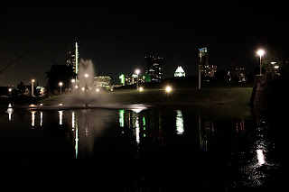
Scenic SkyLine:


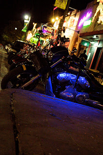
 Night Life :


I Had An Awesome time Capturing these pictures. I think Austin will be very beneficial for me .
Im Excited for My future in Austin Texas .  Call me if your interested : 210-848-8490
Short sketches 4 Project:

TimeLine

Day 1 :Missed the first day
Day 2 : I decided what i was goin to do and where i was doing it .
Day 3 : changed my idea and sketched out some ideas
Day 4 : I bought my supplies
Day 5 : finished my blog
Day 6 : Finished my project . Woke up @ 7 to take pictures. stayed up all night to take some more pictures and to edit my project.
Day 7 : Presented my project
Day 8: fished putting my project on my blog

Problems

The blog is telling me i have logged out from another location. Do you want to log in again. This was happening every other second so its pretty annoying

Problem: I found out that doing this project in one day isnt the way to go . I need to use my time more efficiently.

I hadn't attended class this day so Elijah from my group sent this to me


Friday, September 21, 2012


I am from San Antonio ,Tx.  Currently living in Austin to go to school at the Art institute. I specialize in action shots, studio photography, location photography, and different events like weddings, parties,concerts, or promotional work.

I have always expressed myself through art in various ways : painting & photography have been the two that i have enjoyed the most and the desire to reach others emotions with my art has always been encouraging me to keep taking the next step to be a real professional at my craft.

When Im capturing moments of the real world , there isn't much planning beside location . Anything can happen and i think thats the beauty of it. Capturing people that live life to the fullest of their abilities ,  In order to get the best shot i take many photos of the same image .  I use the trial and error method and it works very well for me .

There are many photographers i respect but no two people have the same vision or level of creativity in capturing their vision. Thats what sets us apart from the others who think everyone can be a photographer.  Everyone can be a photographer but adding the right values of color, lighting , & different angles sets me apart from others.
I have a unique gift and i want to share it with the world.   

My plan is to have my own magazine , A magazine for the people and not only celebrities.  A magazine fulfilled with the different styles, different life's, different cultures, the truth about life and to gossip whats happening in this city. I think it would be beneficial for businesses and for the city itself .

Currently I have a website MyLifeSA.com but it was time for a change so i moved to Austin to start over.  Austin has several amenities that will be beneficial to me and Im excited to get this started with my unique work.  You can also check out my blog i did for class.  It has some other work I’ve done in the past , 

MyLifeATX will be the center of attention and will be the new hotspot to check out to see whats new.
If you like my work or have any questions please email me Camrens@live.com 

Live Your Life , MyLifeATX is for You

Wednesday, September 19, 2012

Rhythm
Chapter 6 

Were almost over with the Basics of Photoshop , but First show Rhythm .
Example 11


Rhythm is an element of design based on repetition. To achieve rhythm the repetition must be a clear repetition of elements that are the same or slightly modified.

Photography by Camren Stacy. South Carolina. 2011.


Kinesthetic Empathy is a mental process in which the viewer consciously or unconsciously feels an action or motion that he/she only observes.

P1000604.jpg

Photography by Camren Stacy. North Carolina. 2011.


Alternating rhythm is where the same elements in a pattern appear.

Moss & Cobbles. Oct 21,2005


Progressive rhythm is the repetition in a shape that changes in a regular manner.


 Photography by Lyric Kinard.


Polyrhythmic structure is simply a multi-rythmic design and can give many feelings and show a lot of fluid motions in a single design.


Make Stains, 'Polyrhythmic' Calligraphy by Denis Brown, 2008.

Balance 
Chapter 5

Pictures are alot like this balance beam. a lil tilt and your eye might wonder off the page .

Example 10


Balance is more of an equilibrium in the structure of a design. You can make sure your picture in balanced with a few techniques.


Painting & Picture by Camren Stacy.2011.


Symmetrical balance or Formal balance is when the design has vertical symmetry or both sides of the design are identical.
Stunning: Towering skyscrapers are reflected in the calm water of Singapore's Marina Bay Photography by Vorrarit Anantsorrarak.2008


Asymmetrical balance is placement of non-identical forms to either side of a balancing point in such a way that the two sides seem to be of the same visual weight.


Photography by Camren Stacy. Colorado. 2010


Balance by value or color is achieved by dissimilar objects that are balances by value.

Balance by pattern or texture - The two can make objects balnces by changing the shape of the oject or the texture.
Photography by Camren Stacy. 2011


Balance by position and eye direction
balance of position is a larger weight closer to the center point can be balanced by a lighter weight further away from the center of the page.


IMG_2561-1.jpg
Photography by Camren Stacy. South Carolina. 2011

balance by eye direction can be led to a certain point in the picture depending on how the elements are arranged.


Photography by Camren Stacy. North Carolina. 2011

Radial Balance is when all objects radiate from a single point

Photography by Camren Stacy. Virginia. 2011

Crystallographic balance is Balance with equal emphasis over an entire two-dimensional surface so that there is always the same visual weight or attraction wherever you may look. Also called allover pattern.

Photography by Camren Stacy. South Carolina. 2011.

Imbalance is a Lack of proportion or relation between corresponding things

Tuesday, September 11, 2012

Scale and Proportion
Chapter 4 

Now to show scale and Proportion draw the same shape with different sizes to show depth
 Example 9

Proportion is a design principle that has to do with the relationship between size and scale.

  • Size is how large (or small) an item actually is. It is a measurable quantity.
  • Scale is a relative size. It refers to how Large (or small) an item seems.


Proportion is the relative size of parts within a whole. The Human Body is an effective example of the design principle.


Proportions of the human body as a reflection of cultural ideology


Leonardo da Vinci Vitruvian Man (1487).
Galleria dell' Accademia,Venice

This famous drawing is based on the geometrically calculated ideal human proportions described by the ancient Roman architect Vitruvius in the Book III of his treatise De Architectura.  According to the Vitruvius the human figure was the primary source of proportion used in Classical orders of architecture.


"The Motherland Calls." Wikipedia. Wikimedia Foundation, 04 Sept. 2012. 


Looking at the statue itself, you cannot tell how large it is. But Look down at the base and see the visitors looking at it and you get an idea of the enormity of this monument.

The Actual size is 170 ft tall and the sword alone is 108ft


Internal References 
The scale of artworks can impress or hold our attention through their actual size. Scale within a work of art provides meaning, context, and often a clue to how it is made or how we are meant to interpret the image or object.


Art Musuem in New York City. Photography by Camren Stacy . 2011
Contrast Of Scale 

Unexpected or Exaggerated Scale 
An Artest may purposely use scale to attract our attention.  We notice the unexpected or exaggerated, as when small objects are magnifies or large ones are reduced.


Art Musuem in New York City. Photography by Camren Stacy . 2011


Manipulation scale and proportion

Surrealism is an art based on paradox, on images that cannot be explained in rational terms. Artist who work in this manner present the irrational world of the dream or nightmare  (recognizable elements in impossible situations).


Art Musuem in New York City. Photography by Camren Stacy . 2011


Geometry and the ideal
Proportion is linked to Ratio. We judge the proportions of something to be correct if the ratio of one element to another is correct.


The Ancient Greeks desired to discover ideal proportions, and these took form of mathematical ratios. The Greeks found the perfect body to be seven heads tall and even idealized the proportions of the body.  In a similar fashion they sought perfect proportions in rectangles employed by architectural design. Among these rectangles the one most often cited as perfect is the Golden Rectangle.
The Golden Rectangle has influenced art and design throughout the centuries.


 Root Rectangles
Like the golden rectangle, other rectangles are derived from the square. These are called root rectangles and have proportions such as 1:2, 1:3, 1:5. Exploring the dynamics of these shapes and finding their expression in art and design is very interesting.